Presenting in an appropriate format for the device
RefTracker uses responsive design so it automatically determines the size of the screen it is being presented on, and reformats all of its client interface screens in a way that enhances usability for that size of screen. This responsive design means that RefTracker automatically reformats to an easy to read layout on the smaller screens of mobile devices.
- On desktop sized screens, the normal client layout is used, unless the client interface page is used in a window or iframe that is of a similar width to a mobile phone, when the display will automatically switch to the mobile phone format.
- On tablets (screen of less than 1024 pixels), normal client interface layouts are used, but the hamburger style mobile menu is used.
- On mobile phones (or any window of less that 768 pixels), a larger font is used, fields are presented full width to provide a neat and easily used format, the required indicator appears before the field and the label appears on a line above the field, and buttons like “Submit” are larger.
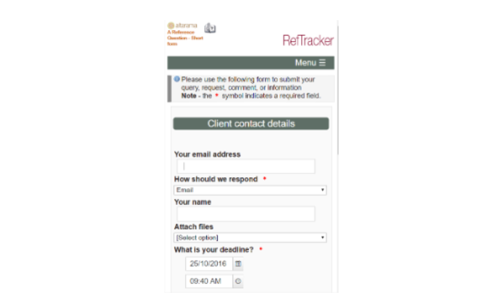
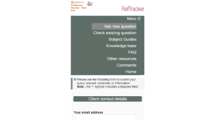
The RefTracker header bar navigational links are substituted by a hamburger style “Menu” bar that when clicked shows all of the navigational options. Click the top “Menu” line again to have the menu items contract.
- The header and footer used when client interface pages are used on a mobile phone can be removed, or specifically designed to fit the mobile phone format.
Your System administrator can override this automatic behaviour using Parameter 80.16. System administrators will want to do this if they have created their own custom css to handle displays for smaller screens like mobile devices (see Header, footer and colour customisation for details of how to do that).
For more information about using RefTracker on your mobile phone see this help page.