RefTracker forms on mobile phones
Your RefTracker forms will automatically reformat to a small touch screen friendly layout if the system detects that the form is being used on a mobile phone (or if size of the space the browser is displaying in is less than 768 pixels). It will also use a smaller header/footer that is more suitable for this environment and special menu bar. For information about this special layout see Presenting in an appropriate format for the device.
There are many layout aspects of the form that you can control when displaying on a mobile phones. For more details see the section on headers and footers.
The automatic presentation of this modified layout can be prevented using parameter 80.16.
If you have email on your phone or tablet, the hyperlinks to RefTracker, in RefTracker emails, will open on your mobile phone or tablet.
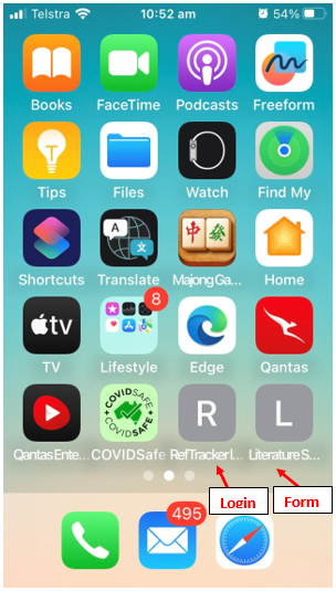
You can also create an application icon for RefTracker on your phone or tablet, to provide easy access to it. To do that, bring up the RefTracker client interface page you want easy access to, using the web browser on your device. On an Android device click the three dots, and on an iPhone click the Share icon, and then find and click the “Add to Home screen” option. An application icon will be created on your phone or tablet.