Open questions analysis
Open question analysis provides some graphical representations of your Requester service Open question workload. Use these graphs to get a quick picture of the balance of your workload for end users, between your staff members. By default these graphs are only made available to Supervisors (who see just the workload for their location) and Administrators (who see the workload for the whole system), but your System administrator can make them available to other users if appropriate.
Each graph depicts the end user workload by individual operator as it is at that particular moment. The provided graphs are:
At Open questions analysis:
Open questions By Service type analysis
and, under that:
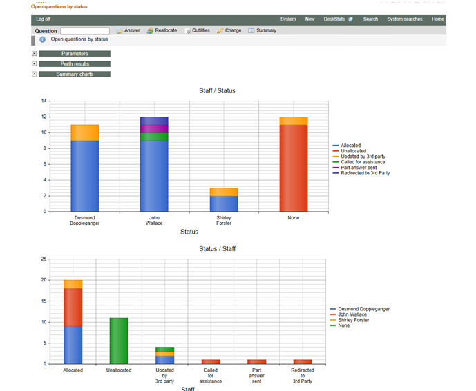
Open questions by Status
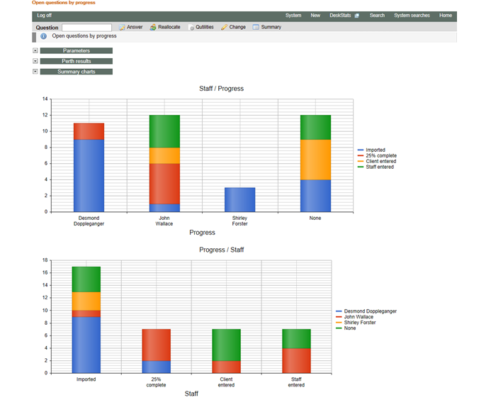
Open questions by Progress
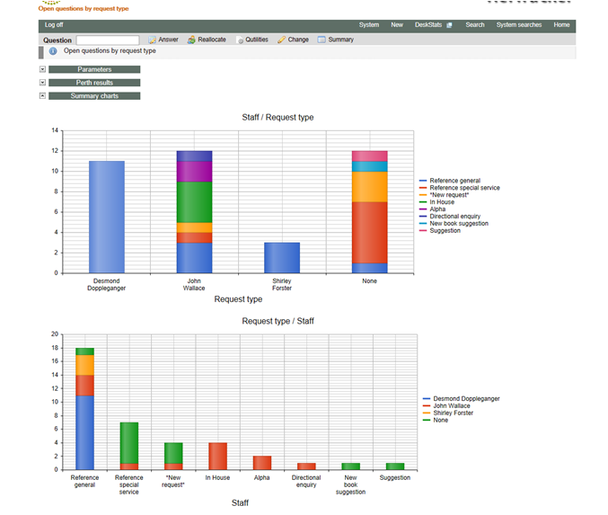
Open questions by Request type
In addition to these three standard views, if you click Open questions>Open question analysis, a set of parameters shows so you can easily analyse by ANY Y axis criteria – for example you might want to use this screen to view an analysis by Received via, to see how questions your staff are working on arrived.
The default Y axis value for this screen is Service type, showing the proportion of Client service vs Sub question tasks being handled by each staff member. This screen will initially show the analysis that you last did using this screen (so, for example, it also remembers the location/s you selected). In effect, it gives you an additional, variable, way (over and above the standard reports provided on the next level of this menu item) to analyse your Open questions.
Three standard graphs appear under the Open questions>Open question analysis menu item and are also accessible from the Home screen for Supervisors and above, together with a small graph of your comparative incoming question workload – its worth taking a look at!
In these standard reports, you can change the Location, Request type and graphing parameters, by clicking the “Parameters” division header and making the parameter changes that you want (and clicking Submit). The dates are set to the first date that your system supports (usually one year before the system was built) and the end of today for the current user’s time zone. This ensures that all open service requests are included in these reports/graphs
Most fields are locked because changing them would give a result that would not accurately portray the results for “Open questions analysed by each staff member”. The next time you use these analysis functions you will be presented with the results for the parameters you used last time. Beware – the parameters are not expanded by default, so be sure to notice the Results labels to ensure you are getting the results for all the locations that you want, as the system may have presented a different location/s because that was what you selected last time.
Cursoring over each coloured segment of these graphs shows exactly how many questions are in that group.
To view the numerical results on which these charts were created, click the “<Location> results” division header. Click the header again if you want to close it again.
Here are some examples of the standard report that appear under Open question analysis:
Open questions by status shows an analysis of the current status (last action performed on the question) of each of the questions allocated to each staff member, providing an indication of where staff are up to with the questions allocated to them.
Open questions by progress shows an analysis of the current progress (degree of completion as indicated by the staff member) of each of the questions allocated to each staff member. It is a different way of looking at the workload allocated to each staff member.
Open questions by request type shows an analysis of the type of questions being handled by each staff member.