Graphing any of these reports
Charting/graphing options are available for all of the RefTracker Statistical reports described above, where charts are relevant. To create reports with charts, go to System>Statistics>Statistics reports where you will find up to three parameters according to which, if any, are relevant to that report. Charts are ONLY applicable when Output type is Display (so they are not included in Excel output or in scheduled reports).
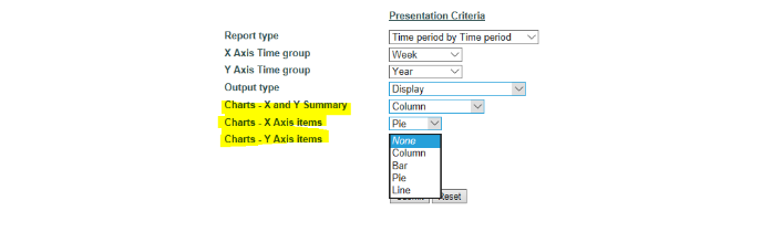
Charts – X and Y Summary provides two charts — X vs Y and Y vs X charts of the type that you select at this parameter – options are pie, line, bar and column charts, plus stacked Column and stacked Bar charts.
Charts – X axis item provides individual charts in the format that you select here – one for each of the X values – options are pie, line, bar and column charts
Charts – Y axis item provides individual charts in the format that you select here – one for each of the Y values – options are pie, line, bar and column charts.
[set chart palette] allows the colour used for these charts to be set to meet your corporate requirements. More details about this feature are provided further down this page.
The amount of data that can be effectively shown in a chart is limited. By default RefTracker charts will show a maximum of 12 X axis (horizontal values), 10 Y axis (vertical values), and 8 values in a pie chart. They will be the largest values. If this does not cover all the data, the last column, row, or segment, will be labelled “All others” and show the total of all other values not already included in the chart/graph.
Each of these axis maximum presentation values can be changed by editing the config/settings/charts.xml file, if needed, but note that the colour picker is limited to 20 colours.
The legend for a chart, and the order of presentation of data in the chart will generally be presented in order of largest to smallest value. If you need a chart that uses another order, Excel charting is a good option.
The data used to create the charts, can be seen by expanding the Analysis division at the bottom of the screen. Totaled values for data grouped into “All others” are shown here.
If a graph would present no information it will not be displayed.
Not all types of charts will make sense for the values in the data you have collected. Please always check that the graph is correctly depicting the point that you want to make. We recommend the following Summary charts for these common reports:
Time period by Time period – Line chart
Relationship type by code table – Columns (stacked)
Target date by code table – Columns (stacked)
Timeliness by code table – Columns (stacked)
Time expended by code table – Columns (stacked)
Cost by Code table – Pie chart
Code table by Code table –Pie chart if only one row or column, otherwise Columns (stacked)
The data on which the charts are built displays first, followed by the charts you select. Leave the appropriate chart parameter set to “None” if you do not want that type of chart.
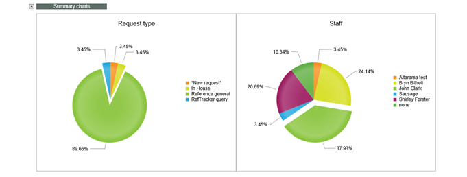
The largest segment of a pie chart will be exploded to provide more interest to the pie chart.
Place your cursor on a segment of a chart and a tooltip will show you the name of that segment.
Pie charts fit two to a line and will automatically expand in size as the size of the browser window expands, so use a full screen browser to see a big chart, or squeeze the browser width to see a smaller pie chart.
To copy a chart to WP, take a snip.
-Where a legend appears on the right hand side of a graph or chart, clicking an item in the legend removes it or reinstates it from the graph e.g. in the screen print below you can see that “Phone” and “RefTracker external” have been clicked as they are greyed out in the legend and are not appearing in the vertical bars.
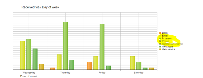
Bar, column and line charts will scale down as the size of browser window decreases, but have a maximum size of 900 pixels.
Set chart palette
The Set chart palette link allows the colours used by the Graphing process to be changed to suit your corporate needs. System administrators can change the colours. The colour palette set this way is used for all users system wide. The starting palette uses the colours used by Google for graphing.
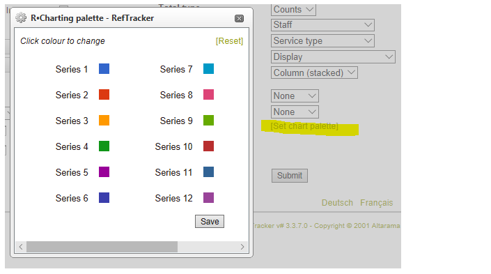
To change the colours (system wide) click [Set chart palette] to show the colour palette.
To change any particular colour, click on the colour swatch and a colour selector will appear. Click the new colour you want to use.
Click the harlequin box with the red diagonal line to remove a colour choice (so don’t use that here – everything should have a colour).
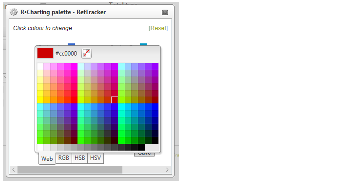
When you are happy with the colours you have chosen, be sure to click Save, to save your changes.
[Reset] will reset the colours back to the default Google colours. Click Save to confirm your reset.
Because this colour picker sets the colours system wide (so that all graphs produced by it have a similar look), the default permission level for use of this function is System administrator, but there is a user signon Function that can be used to make this functionality available to other users.